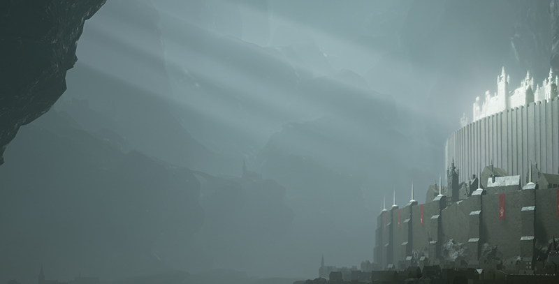
To fix this problem, I've decided to create another gap on the left side of the cave, which would create lightrays that are visible in landscape mode, break up that empty space and also lead your eye to the focal point. I also added some more interesting shapes and buildings at the back in hopes that their silhouettes would make that huge empty space a little bit more interesting too, and I think it worked out quite nicely.

I hope you keep posting updates on your project/s. I am a Game Art Student myself. And I like how efficent and 'lazy' you work. It's kinda my style too. But not that awesome looking... yet :p
ReplyDeleteHey man! Thanks! I had no idea people read this... I'll have to start updating it again :p
Delete